A kitchen does not have to play it safe to feel sophisticated.
This striking London kitchen is proof that neutral cabinetry can sit happily alongside bold colour, warm metallic finishes and plenty of personality. The result feels considered rather than chaotic, with a calm foundation that gives the more playful design choices room to shine.
If you love the idea of introducing colour into your kitchen but worry about going too far, this project is a brilliant example of how to get the balance right.
Start with a calm, neutral kitchen
The cabinetry comes from the Pronorm X-Line range, finished in Pebble Grey.
This soft grey creates a simple, understated base for the room. Rather than competing with the stronger colours elsewhere, it allows them to become the focus.
The handleless design keeps the cabinetry feeling sleek and contemporary, while dark brushed brass handleless rails add definition and a subtle contrast against the lighter doors.
It is a useful design trick if you want a kitchen with personality. Keep the larger, more permanent elements relatively restrained, then use colour, lighting and accessories to create the character.
Add interest with terrazzo-inspired worktops
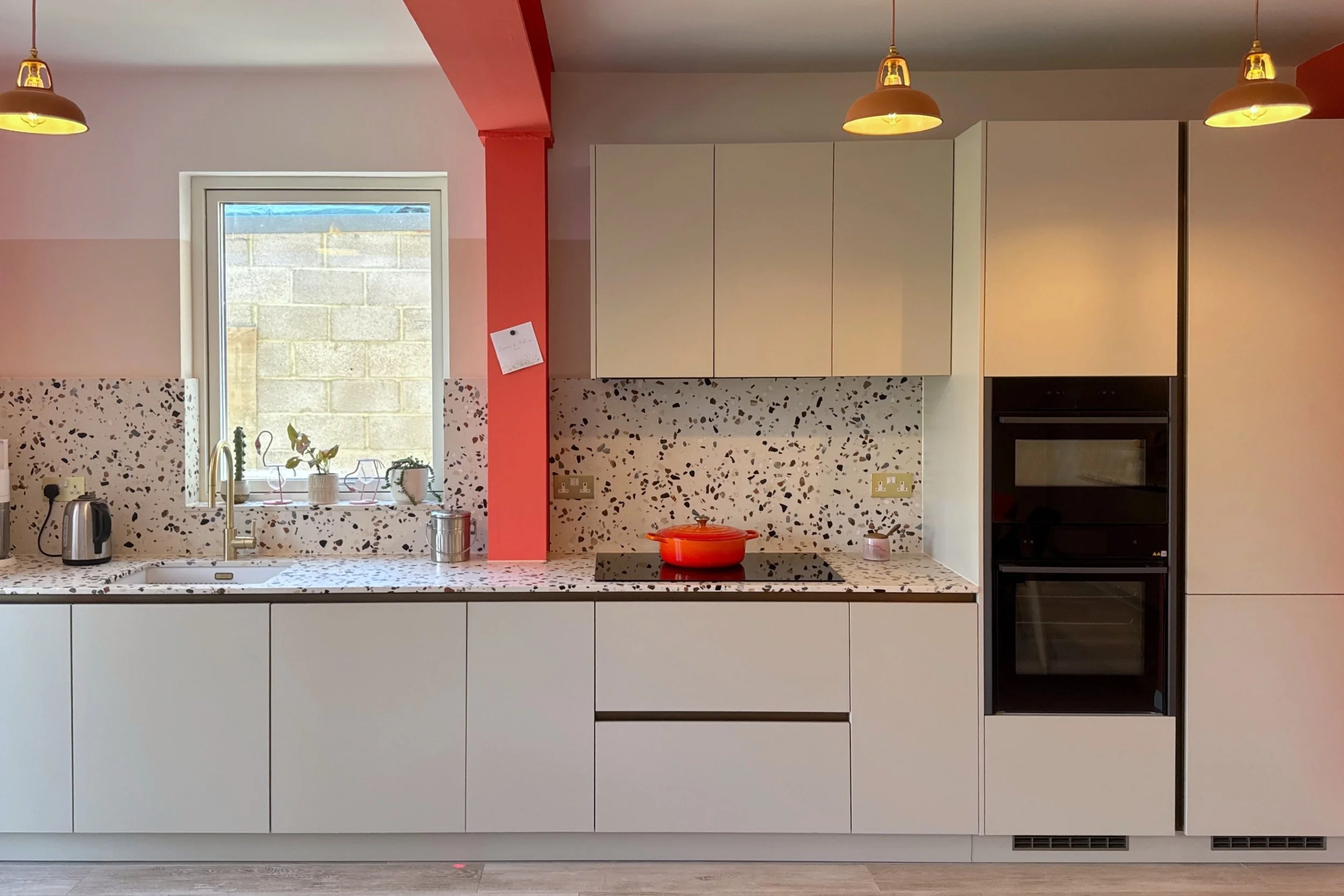
The worktops are 20mm Compac Petra Estremoz Terrazzo quartz, with the same material continuing into the splashbacks.
The terrazzo-style pattern introduces texture and detail without making the overall scheme feel busy. Using it vertically as well as across the work surfaces also gives the material more impact, creating a cohesive backdrop around the cabinetry.
Against the Pebble Grey doors, it adds just enough movement to stop the neutral elements feeling flat.
Warm up the scheme with brass and gold
Metallic details help tie the different areas of this kitchen together.
The dark brushed brass rails bring warmth to the cabinetry, while a gold pull-down spray tap provides a more decorative focal point around the sink.
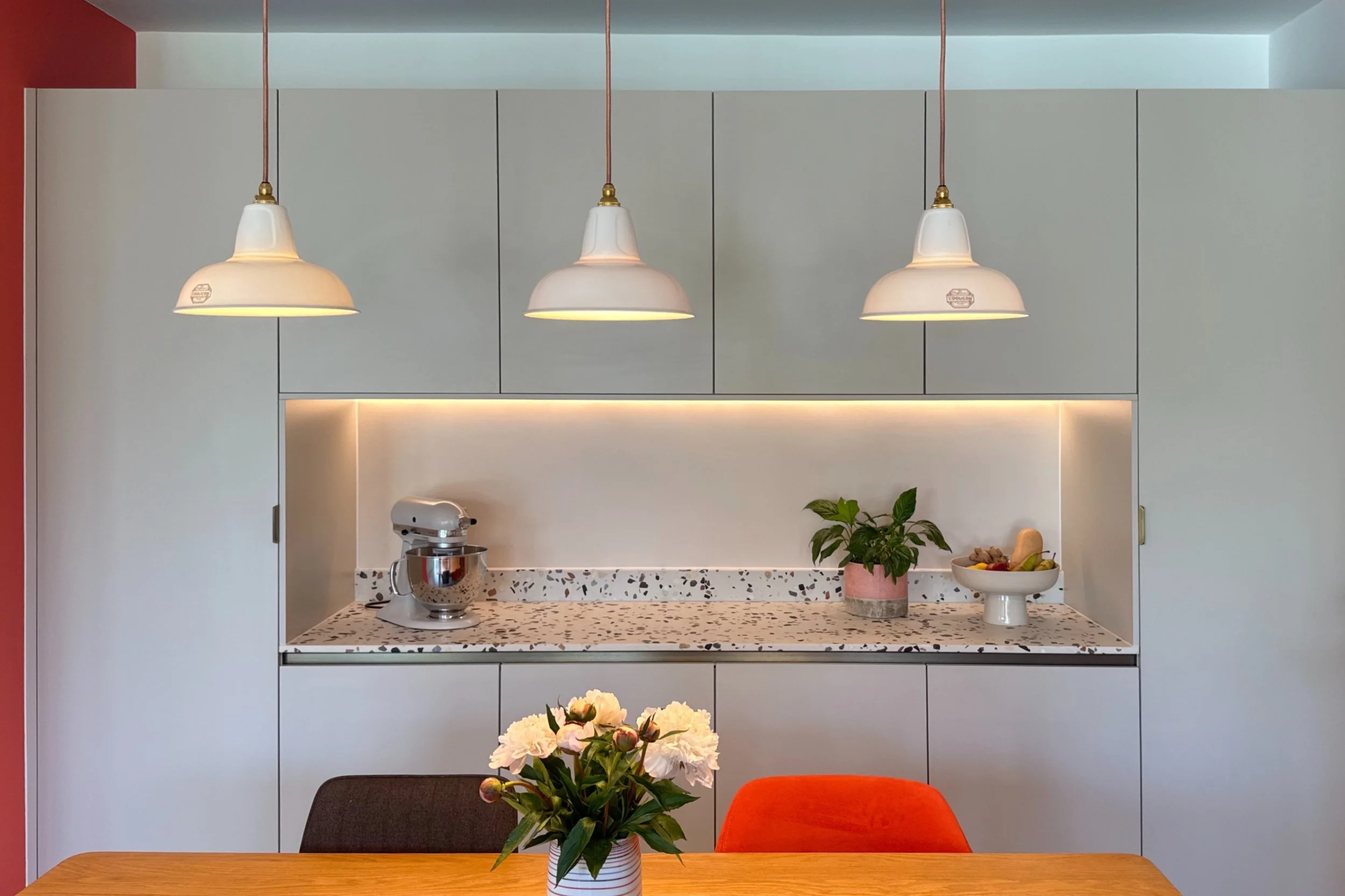
White and gold pendant lights continue the theme throughout the space. Rather than introducing another competing finish, repeating gold in smaller details gives the room a sense of consistency.
It also helps soften the more contemporary elements of the kitchen, particularly when paired with natural wood and greenery.
Let one bold colour steal the show
The feature that really gives this London kitchen its personality is the confident use of coral.
Most of the walls are painted in a neutral beige, taken approximately three-quarters of the way up the wall. Above this, the exposed beams and fireplace are picked out in a bold coral shade.
It is unexpected, playful and completely changes the feel of the room.
Importantly, the coral has not been used everywhere. By concentrating the strongest colour on architectural details, it makes those features stand out while allowing the kitchen cabinetry itself to remain timeless.
If you are nervous about choosing brightly coloured kitchen doors, taking colour onto the walls, ceiling, beams or fireplace can be a clever alternative. These areas can also be repainted more easily if your tastes change later.
Mix rather than match
The dining area continues the relaxed approach.
A wooden dining table brings natural warmth into the scheme, surrounded by deliberately mismatched chairs rather than a perfectly coordinated dining set.
That little bit of imperfection is important. It stops the room feeling overly styled and gives it the sense of a kitchen that has evolved naturally over time.
Indoor plants are used generously too, adding greenery, texture and softness against the grey cabinetry, terrazzo surfaces and coral paintwork.
Keep the practical details strong
Behind all the colour and character, this still needs to work as an everyday kitchen.
A selection of NEFF appliances is integrated into the design, maintaining the clean lines of the Pronorm cabinetry while providing the practical features needed for cooking and entertaining.
The pull-down spray tap is another example of combining practicality with style. It brings a useful feature to the sink area while also contributing to the wider gold and brass palette.
How to recreate this look
The key to getting a colourful kitchen like this right is restraint.
You do not need every element to make a statement. In fact, this scheme works because the quieter materials give the bolder choices more impact.
Start with neutral cabinetry, introduce texture through your worktops and splashbacks, then choose one confident accent colour. Repeat warm metallic finishes in a few carefully selected places, add natural wood and finish with plenty of plants.
And do not worry if everything does not match perfectly. Sometimes the most memorable kitchens are the ones that feel collected, personal and just a little bit unexpected.
Thinking about adding more colour to your kitchen?
At BCK Interiors, we can help you explore cabinetry, worktops, finishes, lighting and colour combinations to create a kitchen that feels distinctly yours.
If you have been saving colourful kitchen ideas but are unsure how to bring them together, get in touch with the BCK Interiors team and start planning a design with a little more personality.